Red Hand Analytics is easier to use on mobile
A responsiveness refactor makes reports easier to explore on a phone, while larger screens remain the best way to use the complete investigation workspace.
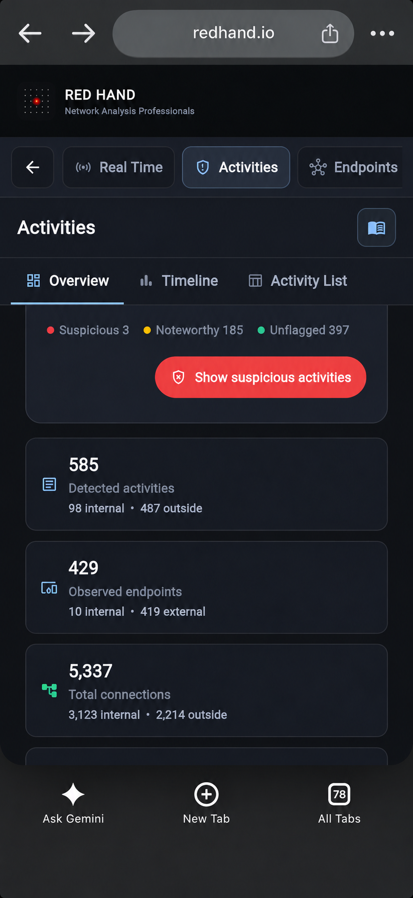
Red Hand Analytics is an investigation workspace with dense timelines, filters, endpoint details, and supporting network evidence. A larger screen is still the best way to see that information together and make full use of the product, but opening a report on a phone should no longer feel like an obstacle.
What changed
We refactored the responsive behavior across Activities, Endpoints, DNS, Data Flows, repeated and long connections, documentation, and the surrounding product pages.
Navigation and view tabs are easier to reach on narrow screens. Timelines and summary cards make better use of the available width, list pagination is more compact, and filters stay out of the way until they are needed. Tables, commands, footers, and other wide elements now provide a clearer mobile experience instead of simply being cut off.
What works better on a phone
You can review activity summaries, move between report sections, inspect endpoints and DNS requests, open supporting records, and perform quick checks with substantially less horizontal scrolling and less interface chrome competing with the evidence.
Filter-heavy lists now open with their filters collapsed. A single Filters control reveals them when needed, leaving more of the screen available for the actual results.
What to expect
This is a meaningful improvement, not a claim that a phone is now the ideal investigation workstation. Complex charts, large evidence sets, side-by-side context, and extended investigations remain more effective on a laptop or desktop display.
Some dense views will continue to require scrolling, and we still have mobile details to refine. The goal of this update is to make Red Hand useful when a phone is the screen available—not to pretend that every investigation fits perfectly into a pocket.